Introduction:
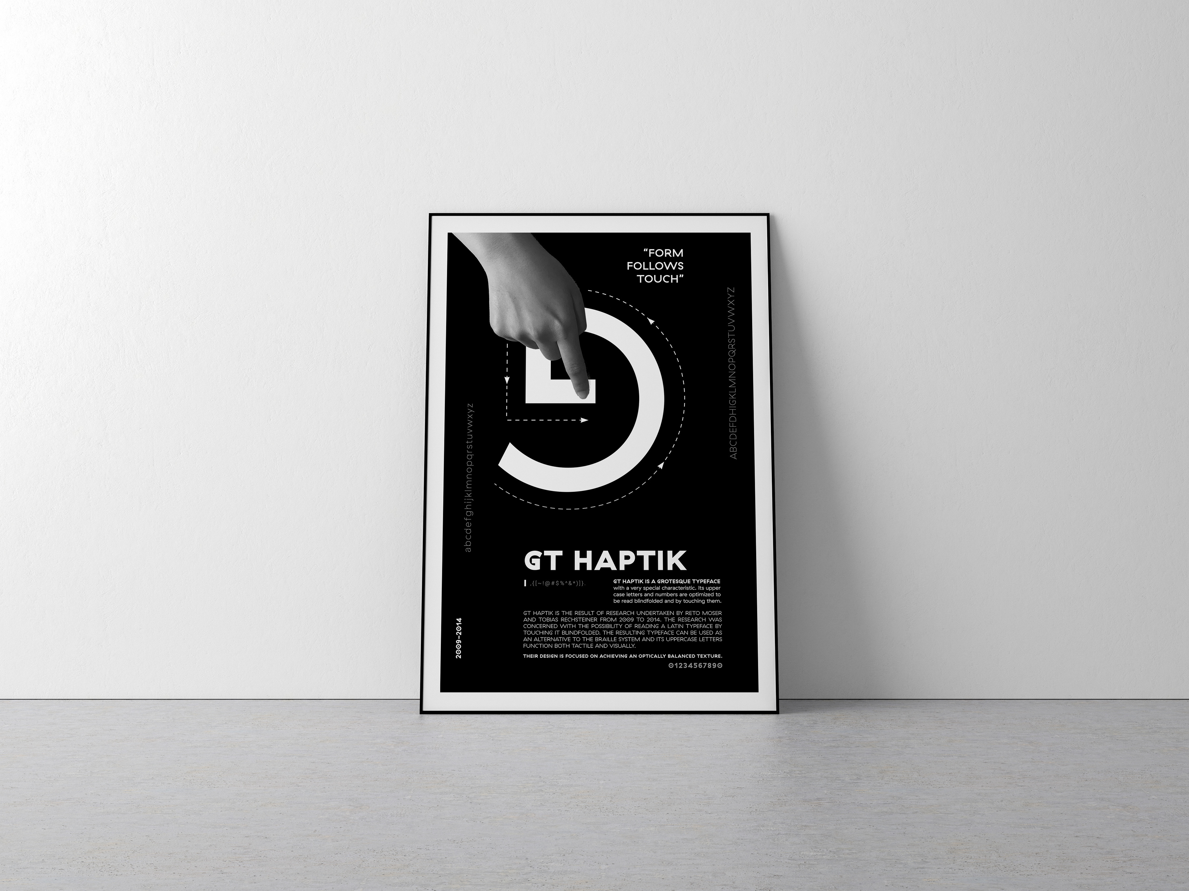
This type specimen poster project is a means of introducing and promoting GT Haptik typeface. The idea is to give the viewer a clear impression of the way the typeface functions at display and text sizes incorporated into brilliant graphic design.
Concept:
"Form follows touch."
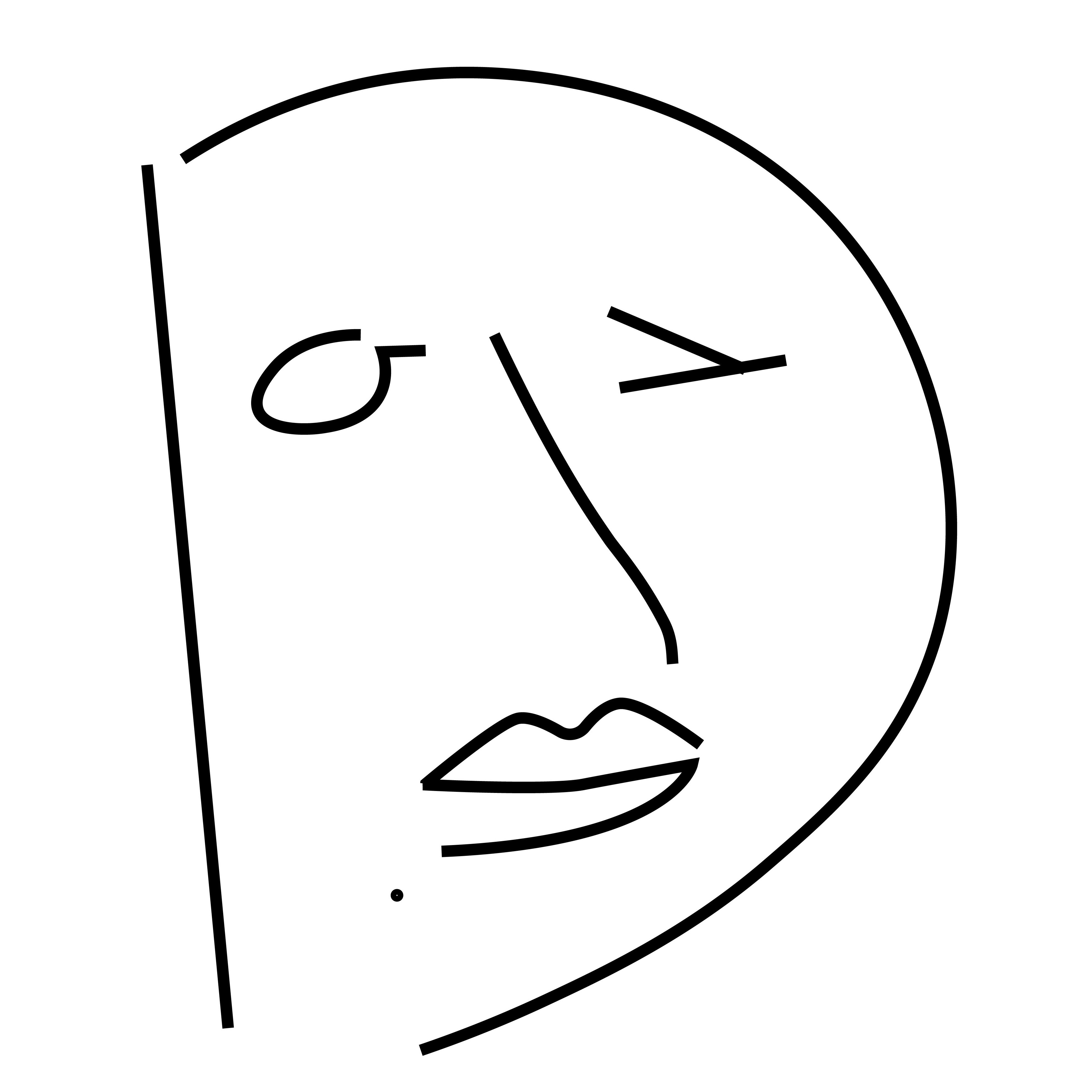
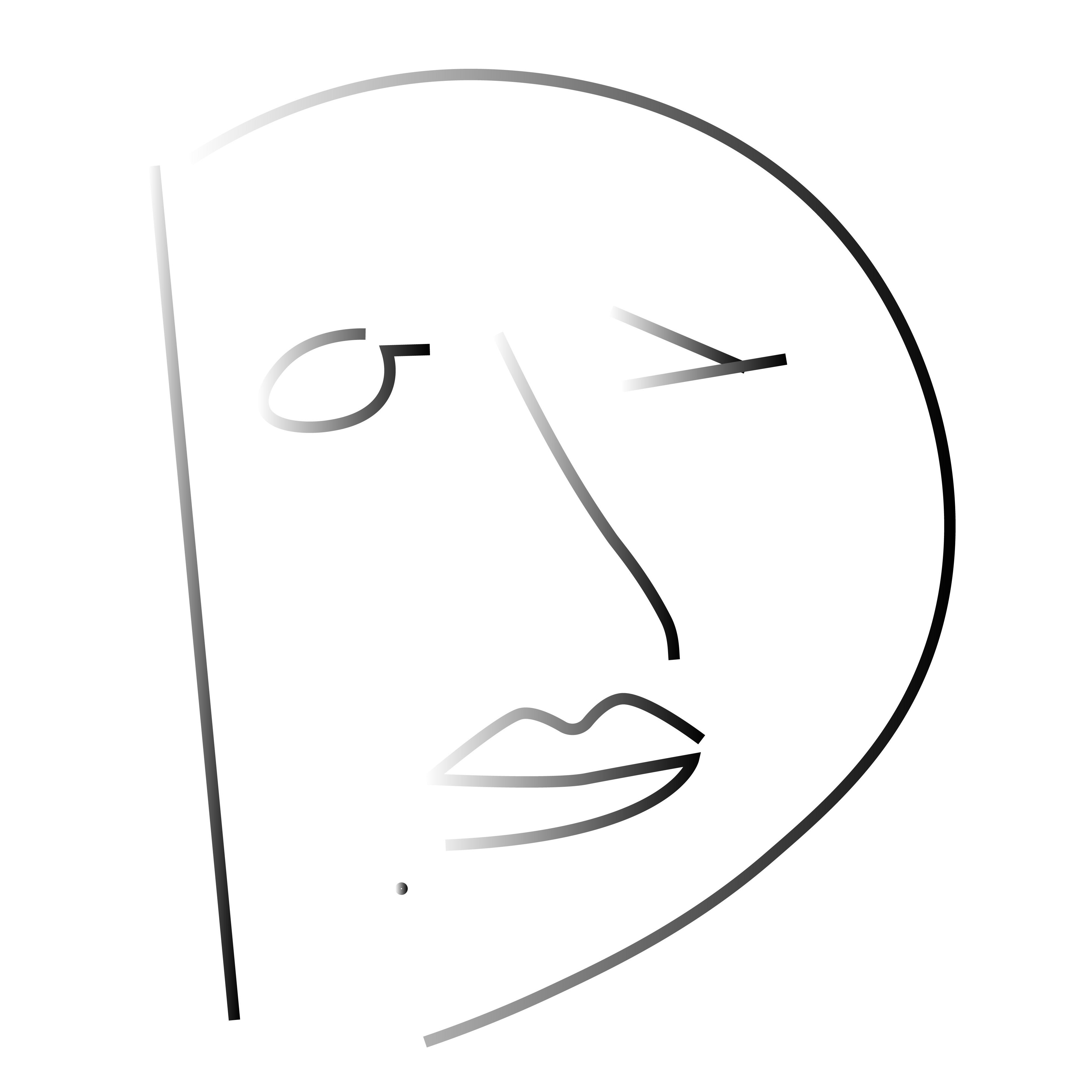
In order to showcase the typeface, I found the following characteristic of GT Haptik. Its uppercase letters and numbers were optimized to be read blindfolded and by touching them. In addition to that, I traced all the uppercase letterforms on the tracing paper. And I found the uppercase 'G' is the most interesting one to me. Thus, I have the idea of using a finger tracing the uppercase letter 'G' to represent the speciality of GT Haptik typeface for this specimen poster.
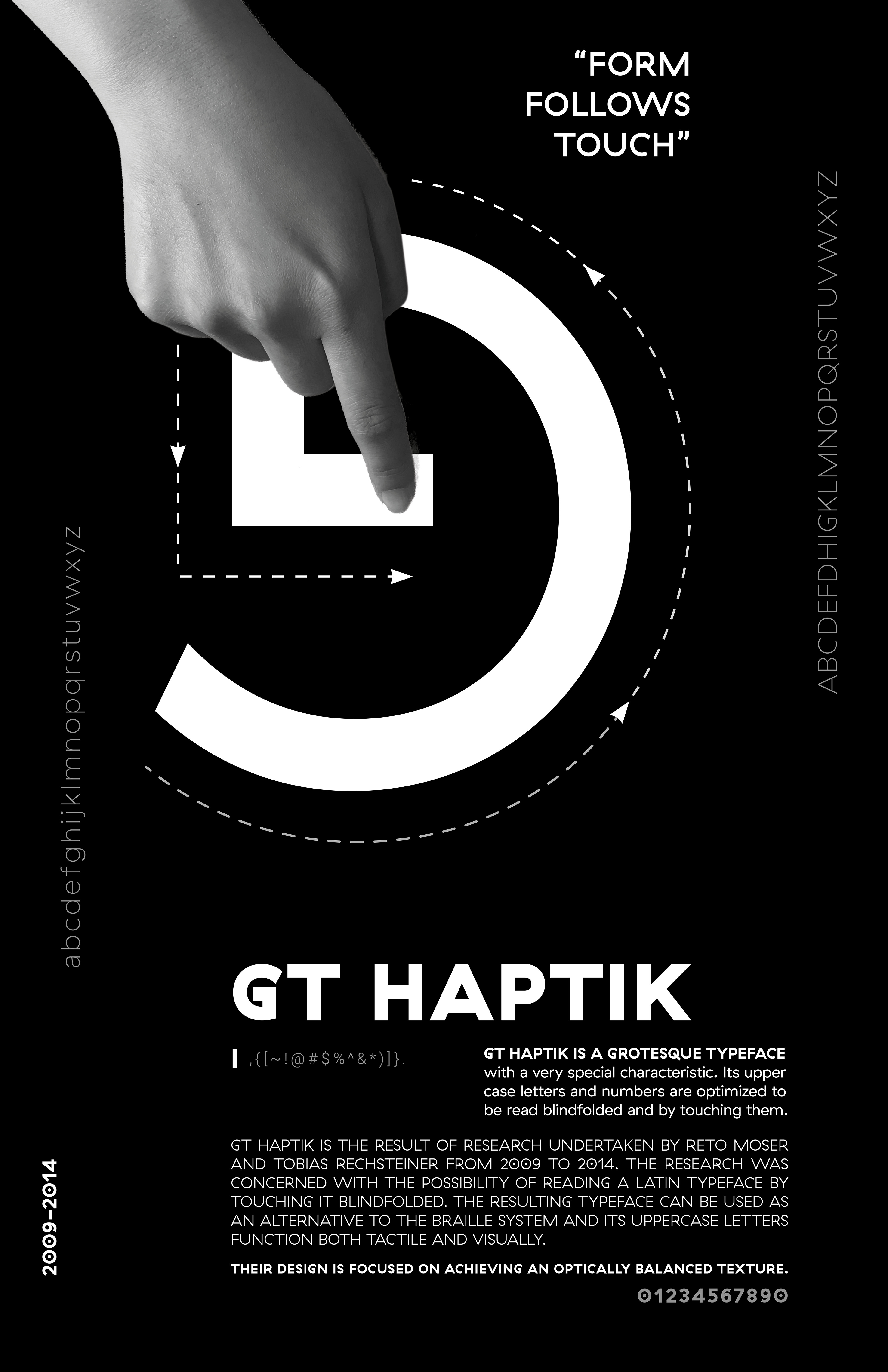
@GT HAPTIK All Rights ReserveD